Most people are probably aware of business-to-business (B2B) and business-to-consumer (B2C) operations. However, they do not encompass the full range of companies. Business-to-many, or B2M, is a marketing term used to describe enterprises that market to both consumers and other companies. For them, a specialized approach to web design is necessary.
B2M can be thought of as a hybrid between B2B and B2C. The B2M marketing strategy will also need to be hybridized. A good B2M website will need to balance its two audiences or risk losing both. Here are some design strategies you can use to build a more effective B2M website.
Know Your Customers
Start with the basics. A successful B2M website needs the same things as a B2B or B2C website. However, information about your audience is especially important.
Build with your customers in mind. Knowing what they need is necessary before any design planning can be done. Effective web design for any business needs to start with this foundation. However, building a website with your audience in mind is critical. It’s likely the services your business provides can have very different target audiences.
Know what to expect from your B2C and B2B audiences. B2B and B2C businesses don’t use the same strategies. As a B2M business, you can draw from both these marketing techniques. Just know that a successful B2M approach will require some level of marketing to both individuals and companies.
Segment When Necessary
One of the unique challenges of designing a B2M website is that your audience is rigidly segmented. A B2M business may offer services to both companies and individuals, but have little to no overlap between which groups use them.
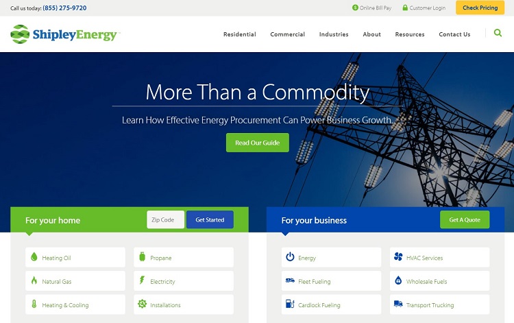
Shipley Energy solves this problem by segmenting the audience on its main page. One of the first things a visitor sees here is two significant design elements that are clearly labeled based on the target audience.
Small differences in the design of these two elements make them more navigable and more apparent to visitors. At a glance, both businesses and consumers know what services Shipley can provide for them — energy and installation for individuals, and larger-scale energy and transport solutions for businesses. When a customer wants to move forward, the options for both are different. Companies are asked for a quote while individual consumers are asked for a zip code, so prices and available services for their area are the only ones displayed.
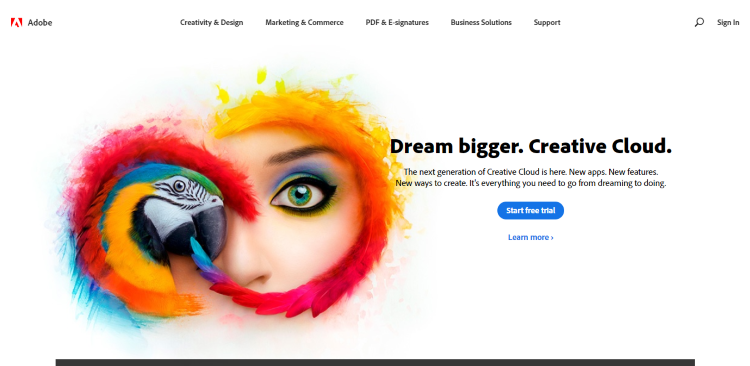
This is a good strategy for when a company has little to no overlap between their business offerings and what it provides to consumers. Segmenting this heavily may not be necessary — Adobe mostly gets away with funneling its customers through a single link on its main page. For cases where a business offers specialized services, segmenting can better target customers and make the purchasing process smoother.
Build With the Customer’s Journey in Mind
Even when you build your website with segments in mind, you still need to consider how all users will navigate your site. UX design techniques, like plotting the customer’s journey, can help you determine how much you need to segment your web design.
Landing page segments are really just one step of building with the customer’s journey in mind. When you construct a website using this design principle, you put yourself in the shoes of the client. The aim is to anticipate the questions they’ll have as they move through your website.
Kaspersky demonstrates what a website built with the customer’s journey in mind can look like. The landing page funnels the customer based on whether they are a consumer or business. It then gathers additional information by offering three different links for PCs, Macs, and mobile devices. Before a customer has even started looking at various software packages, some possible hurdles in their journey have been cleared. They won’t need to worry if they are buying a version of the product designed for businesses or if the item will work on their operating system.
What makes the Kaspersky website design work is that it anticipates questions an end-user will have. The approach works just as well for targeting businesses. The Kaspersky landing page offers three links for companies based on their size. It asks a few questions — like whether or not the enterprise has an IT specialist — to make sure the best range of products is recommended.
Advertise to Your Entire Audience
Businesses that provide the same service for both individuals and enterprises have more flexibility. In some cases, it’s possible to de-emphasize the split in your audience and focus more energy on marketing to everyone.
Adobe’s approach to B2M marketing shows how a traditional B2C plan can be tweaked to better advertise to a B2M market. The main page promotes the Adobe Creative Cloud but doesn’t emphasize the market split between individuals and companies. The header does include two links labeled “Marketing & Commerce” and “Business Solutions,” but it’s clear the website is designed so both businesses and consumers will take similar paths.
Some B2M companies with a strong B2C focus, like Canva, don’t feature their enterprise package at all on their landing page. The result is less design work. Not having to consider both the B2C and B2B journey can free up time and resources to polish your website in other ways.
Building a Hybrid Approach
B2M is more than just B2C plus B2B.
Threading the needle and creating a web design that’s both appealing to individuals and businesses isn’t easy. Companies and consumers don’t respond to marketing the same way, and you’ll need to think outside the box to build a B2M website that works. Applying some of these strategies can help you avoid the most common B2M marketing hurdles.


![15+ Top Black Friday & Cyber Monday Deals for Developers and Designers [2023]](/blog/content/images/size/w960/2021/11/black-friday-deals-developers-1.jpg)
