Web designers often overlook the footer. After all, it is well below the fold. You may not even know how many people bother to scroll to the end of the page. The footer is an area users expect to hold specific information, and they navigate to it if they want that info.
One study found most visitors start to scroll down a page before it fully loads. The most frequently viewed area, attracting 80 percent of visitors, is at around 550 pixels, but even at 1,500 pixels down, 50 percent of visitors view the page.
Your footer should get a decent amount of engagement. If your heatmaps show you’re getting very little involvement, there are some key things you can do to fix your footer.
1. Add a Strong Call-to-Action
Do you have an option for users to engage within your footer, or is it only a copyright notice? Adding a convincing call-to-action, or CTA, in the footer allows visitors to take that next step into your site. Add your newsletter signup button or a shopping button in your footer. Yes, you should also place a CTA higher up on your page. However, including a CTA in the footer helps grab those users who skipped right to the bottom of your landing page.
Compassion International adds a call-to-action button on the left side of their footer to encourage site visitors to sign up for their mailing list. This straightforward form asks for an email and then offers a subscribe button.
2. Simplify Your Footer
While you do want to use the footer to engage your reader, don’t make it cluttered. Then the reader can’t decide what action to take. Some footers cram in a bunch of links to primary areas on the site, a subscribe form, social media buttons and privacy notices. On top of that, they may throw in a map and staff images. If the user can’t figure out the elements of your footer with a quick glance, you’ve added too much and need to cut out anything unnecessary.
3. Share Social Presence
More and more customers prefer to connect with brands they like on social media. Your footer is only one of the places you can add links to your social media sites and draw your site visitors in. Many people know to scroll to the bottom of the page to connect on social media, so your visitors look for links there. Nearly 60 percent of Americans who use social media believe these platforms have made it easier to get companies to respond to their questions.
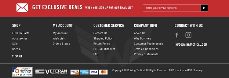
Wing Tactical has a unique take on their footer. Their footer contains vital information their customers are most likely to need upon reaching the end of the page. They also include links to their social media profiles by including the Facebook and Instagram icons and inviting users to “connect with us.”
4. Focus on Your Company Goals
What are your goals for your website? For example, if you run a local restaurant, you might want to encourage customers to make a reservation, view the menu or sign up for a special event. Your footer should reflect those same goals by adding options for your site visitors to take those actions. So, you might have one link to “see our menu,” another to “reserve a table” and a third to “book a consultation for your event.”
Once you know what actions you want your user to take, it becomes easier to add goals to your footer. Look at these as mini CTAs. The wording should be active and personal.
5. Build Trust
One of the primary factors Google looks at in their ranking these days is how authentic and trustworthy your site is. One way to signal you’re trustworthy is to let readers get to know you better. Add a photo and a short bio to the bottom of the page, for example. A personal image is particularly important for smaller businesses and blogs that are still working on establishing a reputation. Keep in mind, most of your site visitors have no idea who you are and whether or not they should trust you with their hard-earned dollars.
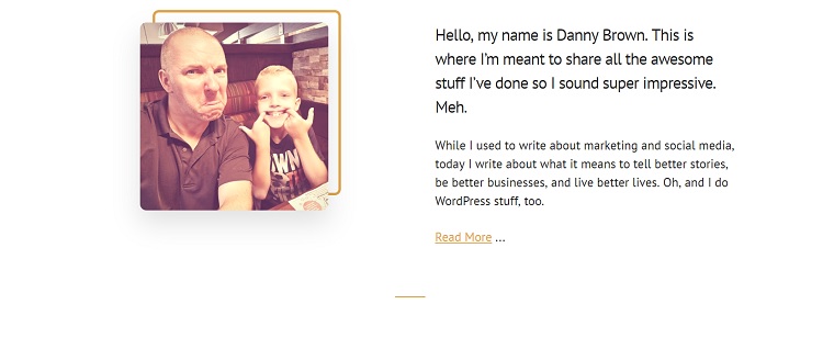
Check out Danny Brown’s website. In the footer, he shares his photo and a short bio to help users get to know him better. He also has a call to action and social media links, but the explanation of the type of work he does makes his footer stand out to new site visitors.
6. Privacy Policy
In 2018, the European Union instituted some new rules called General Data Privacy Regulation (GDPR). It fines websites that collect sensitive information and don’t have clear rules in place to protect that info. To be compliant with GDPR, you must explicitly list a privacy policy as just one of the steps to protect consumers. There is some debate as to whether or not U.S. businesses fall under the GDPR. However, if you have even one visitor from Europe, it’s probably best to go ahead and comply.
A privacy policy also helps build that trust we talked about above. It shows you take the information you collect seriously and plan to protect your customers. However, a privacy policy isn’t something most people look for. It’s a best practice to push it to the bottom of the page and only include a quick link for those who do want more info.
Your Footer Matters
Every element of your website matters. Your footer might get less attention than items above the fold, but a percentage of site visitors will make it to the end of your page and view your footer. Use every opportunity to hook anyone who lands on your page and convert them into leads.


![15+ Top Black Friday & Cyber Monday Deals for Developers and Designers [2023]](/blog/content/images/size/w960/2021/11/black-friday-deals-developers-1.jpg)
