You spend hours driving traffic to your site and engaging with possible customers on social media. Your traffic is pretty steady, but your conversions aren’t where you’d like them to be. You might even get a few leads from your landing page, but then the leads go nowhere and don’t result in sales.
About 52 percent of companies using landing pages test them to see how they might improve the page and conversions. Studying successful landing pages allows you to learn what you can change to make them convert as well as possible. There are some specific things you can change today that will help you gain not only more leads but better leads, from your landing page.
1. Understand Your Target Audience
You already know you need to figure out who your typical customer is and create a buyer persona, but do you understand your target audience? What makes them tick?
Dig deep into analytics to figure out where your customers hail from and what unique characteristics people from that area have. You’ll also want to poll your site visitors, if possible, and do plenty of A/B testing to figure out their preferences. The better you understand your target audience, the easier it is to create a landing page with the language that speaks to their souls.
2. Draw the User’s Eye
If you want people to click on your call-to-action button, you have to accomplish some things, but one of the biggest is drawing their eye to the CTA button. One way to do this is to create a button that contrasts with the other items on the page. A contrasting color makes the button stand out and invites the user to take a specific action.
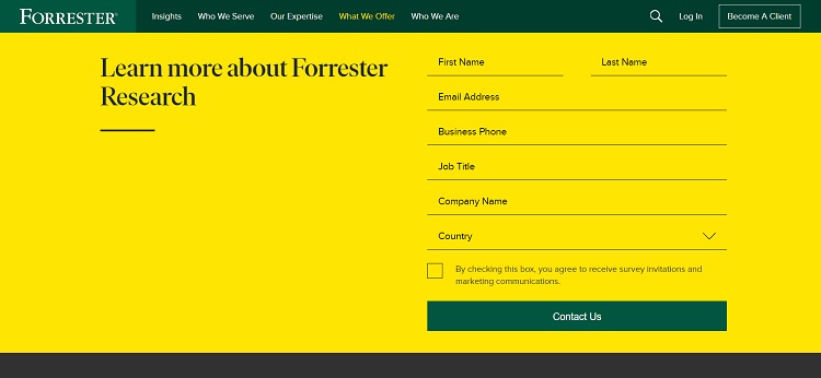
Forrester Research has several landing pages geared specifically to different buyer personas. For example, if you’re looking for a company to conduct research, they offer a highly tailored landing page that outlines the benefits of using their services. Note the vivid colors and the contrasting CTA button that invites the user to contact them for more information.
3. Work on Your Headline
Your headline is what visitors see the minute they land on your page, and often what they see on search results pages as well. Take time to tweak your headline so it speaks to the specific audience you’d like to reach. If you craft headlines that acutely home in on your buyer persona, you won’t get leads who aren’t genuinely interested in your product. Instead, they’ll realize your page isn’t for them and bounce away to another page.
Make your headline personal and aimed directly at those you want to attract as customers.
4. Add Hover Effects
Adding a hover effect engages site visitors and makes them more likely to click on a button. Hover effects occur when a user places their mouse over a specific element on your page. You can use a variety of effects, such as the button size expanding, the color-changing or the button popping out from the rest of the page.
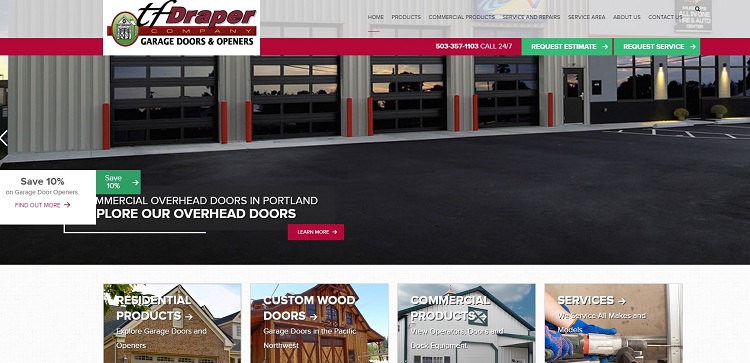
The TF Draper Company features a hover effect on the CTA button on their landing page. The CTA is above the fold. When a user hovers their mouse over the “Learn More” CTA, the button widens slightly, making it clearer and also offering a larger area for the user to click on.
5. Highlight the Benefits
If you’ve done your homework, you already understand your typical user well. Use the information about your buyer persona and figure out what the benefits of your product or service are to that user. Now, highlight those benefits so the user understands how you can help them solve a problem. Just remember to keep these selling points short and sweet.
6. Stay Focused
Keep your focus on the specific purpose of your landing page. If your goal is to gain more leads, everything on your page should funnel the user toward that goal. Remove anything on the landing page that doesn’t tie into the action you want users to take.
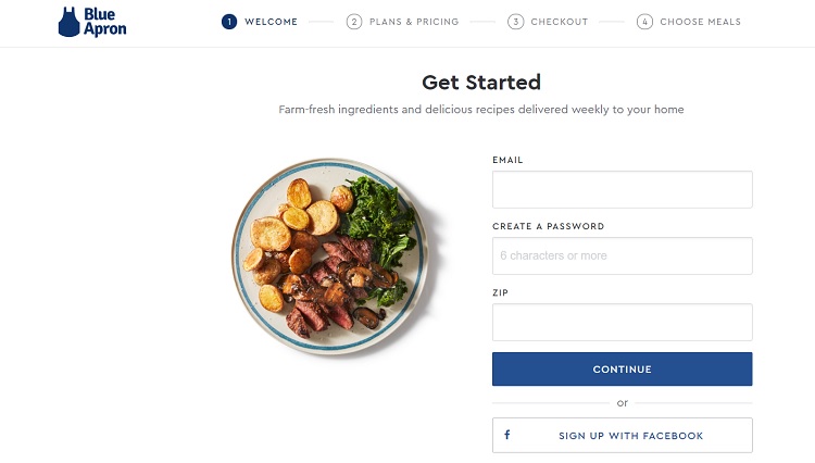
Blue Apron does an excellent job of funneling leads right to the sign-up part of the process on their landing page. Note how everything on this clean, simple page points the user toward becoming a customer. If you hesitate, another box pops up offering $30 off on your first kit. A special discount captures more leads than without such an offer, which we’ll talk about below.
7. Test Your Pages
Take time to test your pages thoroughly and tweak little things that make a big difference. About 58 percent of marketers conduct A/B testing to enhance their conversion rates.
The key is to test one thing at a time. Change the color of the CTA button and test. Try a different headline and test again. Add features such as animated buttons and analyze the response. Over time, you’ll find the perfect combination for your landing page.
8. Offer Something of Value
Imagine you’re a consumer who just landed on your website. What would entice you to share your information? You must offer something of value to the consumer. For example, e-books are virtually ubiquitous, so if you plan to offer an e-book, make it unique and unlike anything else out there.
Other things you can offer include free video courses, webinars, and free shipping or consultations.
9. Tap Into User Emotions
If you want your user to take action, you must reach them on an emotional level. Abraham Maslow’s Hierarchy of Needs indicates you must first meet a user’s basic needs before you can tap into their emotions. While you may not have a lot of control over their housing situation or whether they have enough to eat, you can assume if they are looking at making a purchase, they have likely already met these needs.
Just above the physical needs of food and shelter is the need for security. Does your product or service somehow meet that need? If so, how can you reach the user and let them know it’s safe to do business with you? The levels of the pyramid go up, tapping into social needs such as belonging and then ego needs such as recognition and power. Understanding the steps to reach various emotional levels allows you to meet your customers’ basic needs before tapping into higher-order needs.
Improve Your Landing Page Conversion Rate
Improving your landing page conversion rate takes time and attention to detail. With a little work, you’ll increase the number of viable leads coming through your site.


![15+ Top Black Friday & Cyber Monday Deals for Developers and Designers [2023]](/blog/content/images/size/w960/2021/11/black-friday-deals-developers-1.jpg)
