Web designers are well aware of the importance of using extraordinary imagery along with great layouts and content/design elements to engage the users. Selecting powerful pictures is crucial because it can create or interrupt the user’s emotional connection to the brand or product.
Images represent one of the most powerful weapons of your website. When used correctly, they can have a significant contribution to constructing and growing your online business or, when poorly used, they can ruin all of your work.
First impressions always create a powerful impact, so it is essential to have positive feedback. This being said, you can not use just any picture and hope for a miracle. Imagery has to be used with a purpose. We are often tempted to use images that make our content more colorful and think that this is better than nothing. If the image’s only goal is to fill the blank spaces, it’ll be most likely ignored by the people. Now it’s become much easier – believe me – to transform any kind of picture into a professional one, with a significant impact but do we really know how to use them to achieve our goals?
Here are some tips and tricks on how to use an image in web design.
1. Use pictures with real people.
Studies show that web pages that include images with people are more convincing.
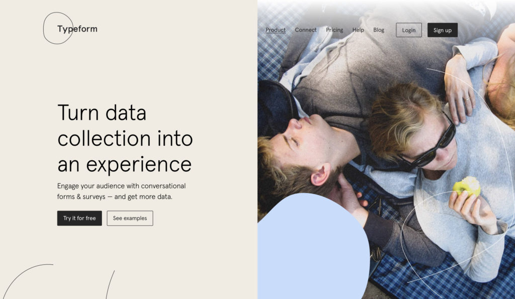
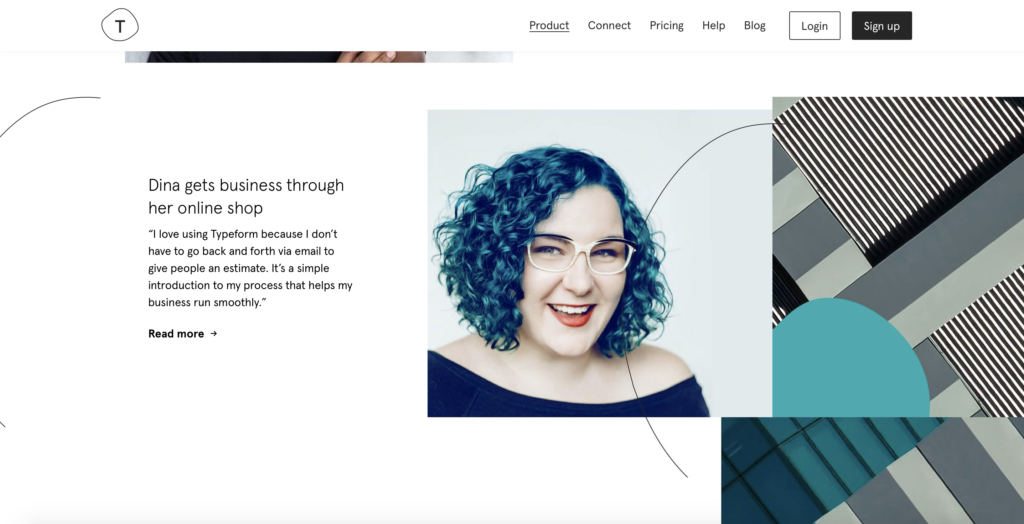
If you add a picture with a ‘’real person’’ (not a stock one) happily doing something in a real environment, not against a white background, you’ll definitely experience a significant engagement growth. You can also use people to guide your users.
Products such as Filterbooth help you transform a real, regular pic from a free image library into a professional one.
2. Find contextual editorial images for pages
According to the site you’re creating, you might need different pics to illustrate various subpages, tales, or blog posts. Selecting all of that is bonded to the context. Make sure it bears strong relevance to the actual subject matter wherever possible. If you don’t have the necessary time or budget to art direct something yourself, fear not – provided the brief is suitable, quality stock images can be more than ideal to your purposes.
Nonetheless, avoid clichés. You must create an association with the product you are talking about, and a generic or too common image will create a negative experience and undermine the authenticity of the website. To avoid this and/or using a to popular picture you can always use your own photos, import them into Adobe Lightroom and transform them with one click using presets created by professionals that work with any kind of image.
You may be interested: Where to Find Free Photos to Use for Your Content3.The image cropping factor
After selecting the most suitable images, cropping them is essential to create an impact with your page. You have to be extra careful and draw your user’s attention on image focusing without leaving too many useless spaces. Responsive websites can create image chaos if the photos haven’t been carefully selected for various screen sizes.
4.Why you should never use stock photography on your website.
Don’t use stock images on your branded website. Stock photos are cheap and easy, though tempting. Do not be tempted by cheap and easy. Humanize your brand: … People enjoy connecting with other people, so don’t be shy and share photos of your staff. Make their pictures look professional with amazing filters. You and the people at your company are infinitely more interesting than those models who have been enhanced in Photoshop. You may not be as pretty or plastic, but you are authentic.
There is also an alternative to this solution: Thankfully, there are free (anti) stock photo sites that solve this problem smoothly.
5. Your website’s speed is also an essential factor.
Once the content of your website is ready, the next goal is to make sure all your site images are delivered as quickly as possible to your visitors. It all starts by choosing the correct format. JPEGs have genuinely revolutionized the web. Do not be afraid to experience lower quality levels in JPEG format. Improving the quality for many does not aim to enhance bandwidth but shorten user waiting times.
The three photo file formats used on the web today are JPEG, PNG, and GIF. These three formats obviously have different roles. PNG should be used for logos (images that have transparency), JPEG should be used when you have captured photos and GIF when the animation is needed.
To optimize the speed of the sites containing images, it is recommended to use Content Delivery Networks. These are easy-to-use services that serve to deliver your website much faster than a hosting provider can. When someone visits your page, he is automatically routed to the nearest location, so images are provided in the fastest time. There are more CDN providers available on the market. Many of them offer free services for small websites, one of which being CloudFlare.


![15+ Top Black Friday & Cyber Monday Deals for Developers and Designers [2023]](/blog/content/images/size/w960/2021/11/black-friday-deals-developers-1.jpg)
