Hello happy coders!
In this mega tutorial, you’ll teach you how to create a responsive admin template using Light Bootstrap Dashboard(LBD) on Bootstrap 4.
All the source file are available on Github and our website so you can start using them immediately and for free.
The first thing you should do is to download LBD.
We will use the template file as an example for WordPress admin. At the final of this tutorial you will get a replica for:
- Dashboard page
- Posts page
- Appearance page
Oh. and everything will be responsive, of course 😁
That’s being said..let’s begin.

Add Navigation Icons to Dashboard
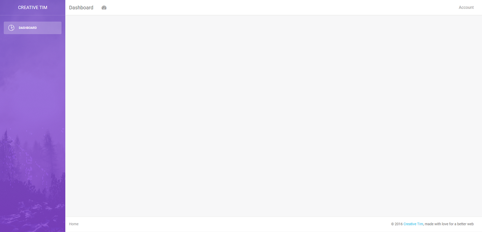
At this moment our template page looks like this.
Step 1. Change the page name
Head to the text editor and open template.html. By the way, I’m using Atom as a text editor.
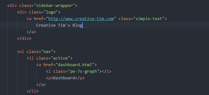
I’ve changed the name of the page to Creative Tim’s Blog
<div class=”logo”>
      <a href=”https://www.creative-tim.com" class=”simple-text”>
         Creative Tim’s Blog
      </a>
</div>
Step 2. Let’s add refresh icon
Let’s go to Font Awesome and get refresh icon <i class="fa fa-refresh" aria-hidden="true"></i>
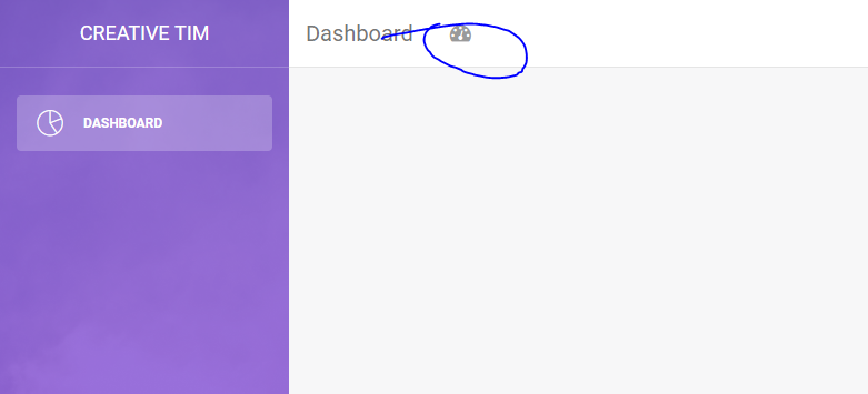
For the refresh icon, I’ll just replace the dashboard icon.
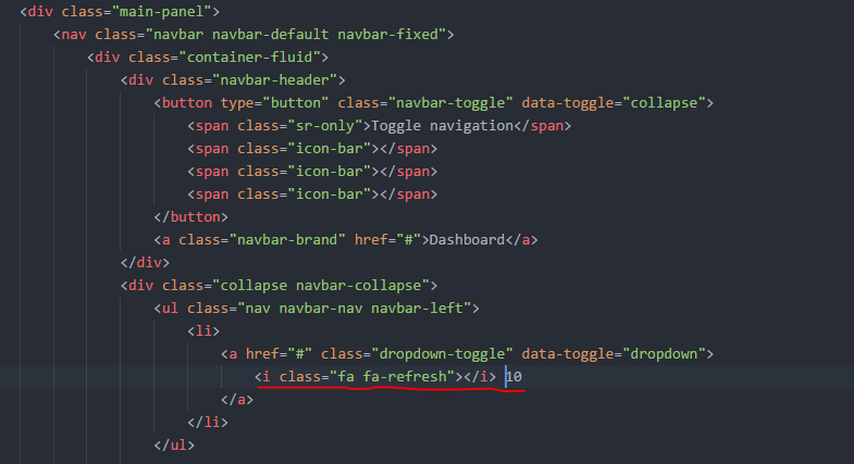
<ul class=”nav navbar-nav navbar-left”>
 <li>
 <a href=”#” class=”dropdown-toggle” data-toggle=”dropdown”>
 <i class=”fa fa-refresh”></i> 10
 </a>
 </li>
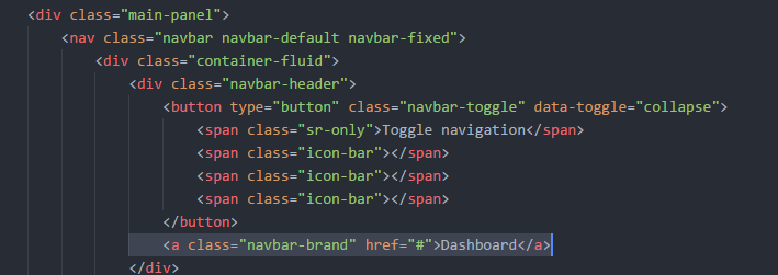
Step 3. Delete dashboard text
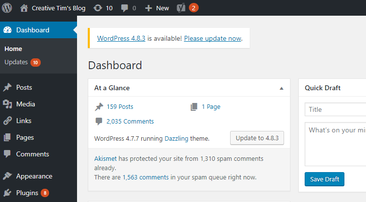
WordPress has the page located inside of the content. In our dashboard, we have the location inside the navigation bar.
I will take it out of our navigation, and we will add it later inside the content so it will look like WP.
So at the moment, I’ll just delete a class="navbar-brand" href="#">Dashboard</a> within the button.

Step 4. Add the comments icon
I’ll use the following icon <i class="fa fa-comments-o" aria-hidden="true"></i>
To add additional icons, duplicate the refresh icon area within <li>
<li>
 <a href=”#” class=”dropdown-toggle” data-toggle=”dropdown”>
 <i class=”fa fa-refresh”></i> 10
 </a>
 </li>
Step 5. Add more icons ❤
The icon I’ll use: <i class="fa fa-plus" aria-hidden="true"></i>
Step 6. Add SEO Button
Here we use only text.
<li>
 <a href=”#” class=”dropdown-toggle” data-toggle=”dropdown”>
 SEO
 </a>
 </li>
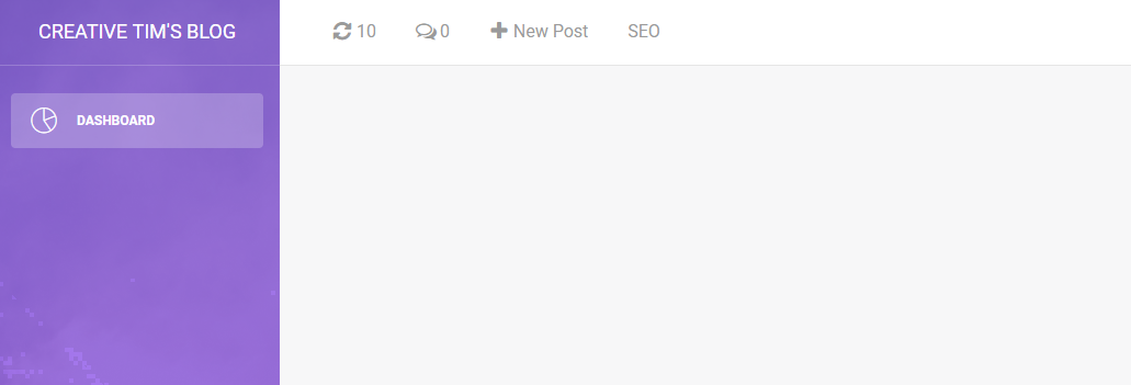
The left navbar should look like this:
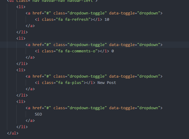
<div class=”collapse navbar-collapse”>
 <ul class=”nav navbar-nav navbar-left”>
 <li>
 <a href=”#” class=”dropdown-toggle” data-toggle=”dropdown”>
 <i class=”fa fa-refresh”></i> 10
 </a>
 </li>
 <li>
 <a href=”#” class=”dropdown-toggle” data-toggle=”dropdown”>
 <i class=”fa fa-comments-o”></i> 0
 </a>
 </li>
 <li>
 <a href=”#” class=”dropdown-toggle” data-toggle=”dropdown”>
 <i class=”fa fa-plus”></i> New Post
 </a>
 </li>
 <li>
 <a href=”#” class=”dropdown-toggle” data-toggle=”dropdown”>
 SEO
 </a>
 </li>
 </ul>
<ul class=”nav navbar-nav navbar-right”>
 <li class=”dropdown”>
 <a href=”#” class=”dropdown-toggle” data-toggle=”dropdown”>
 Howdy, Nice Goddady
 <b class=”caret”></b>
 </a>
 <ul class=”dropdown-menu”>
 <li><a href=”#”>Action</a></li>
 <li><a href=”#”>Another action</a></li>
 <li><a href=”#”>Something</a></li>
 <li><a href=”#”>Another action</a></li>
 <li><a href=”#”>Something</a></li>
 <li class=”divider”></li>
 <li><a href=”#”>Separated link</a></li>
 </ul>
 </li>
</ul>
 </div>
Recreate Drop Down Menu from Navbar
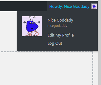
Step 7. Drop Down Menu
We already have a beautiful drop-down menu in our dashboard.html so we can use it in our template.
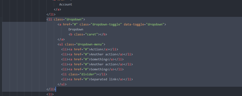

You can customize this however you want. Our Navbar job, for now, is done.
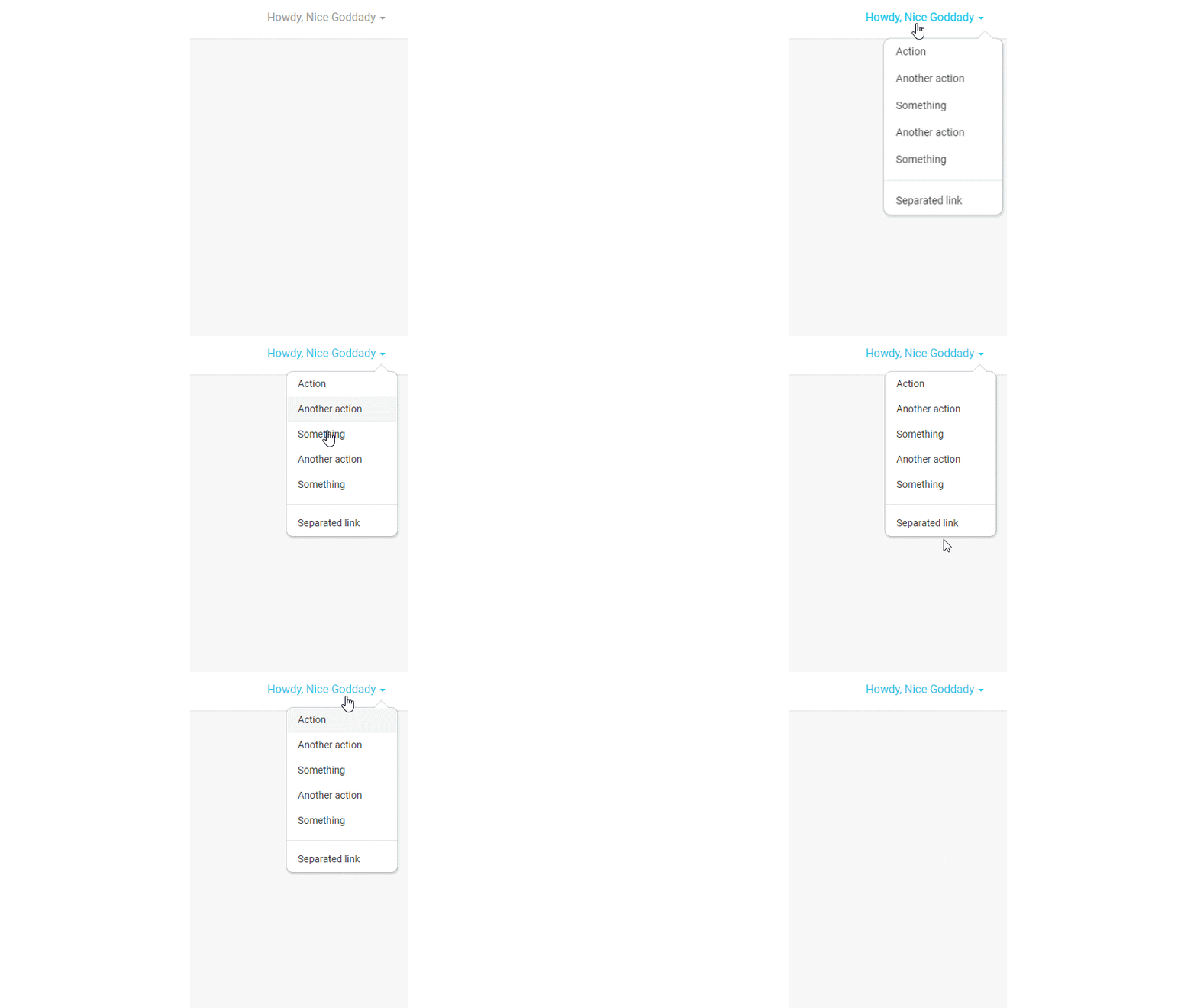
Dropdown Menu
Step 8. Coffee Break!

Dashboard Content Area
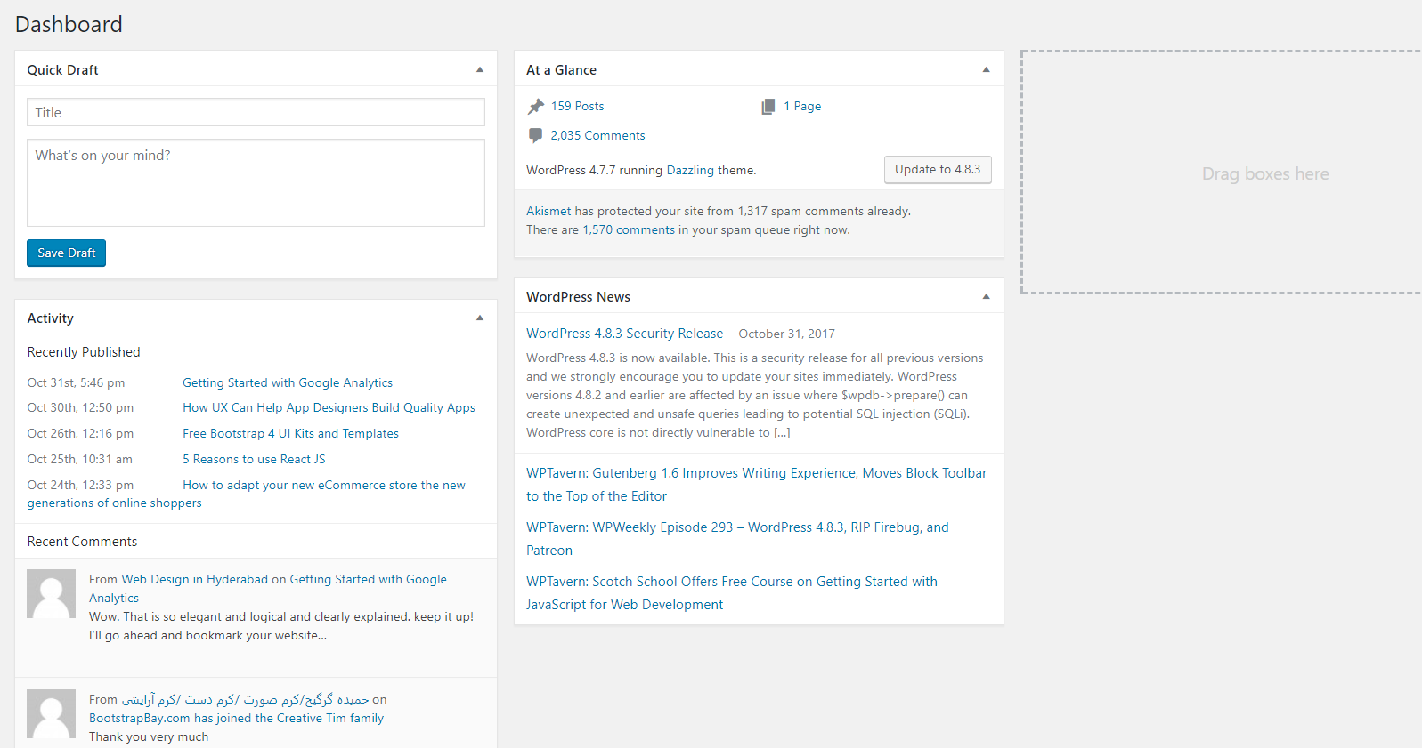 Dashboard
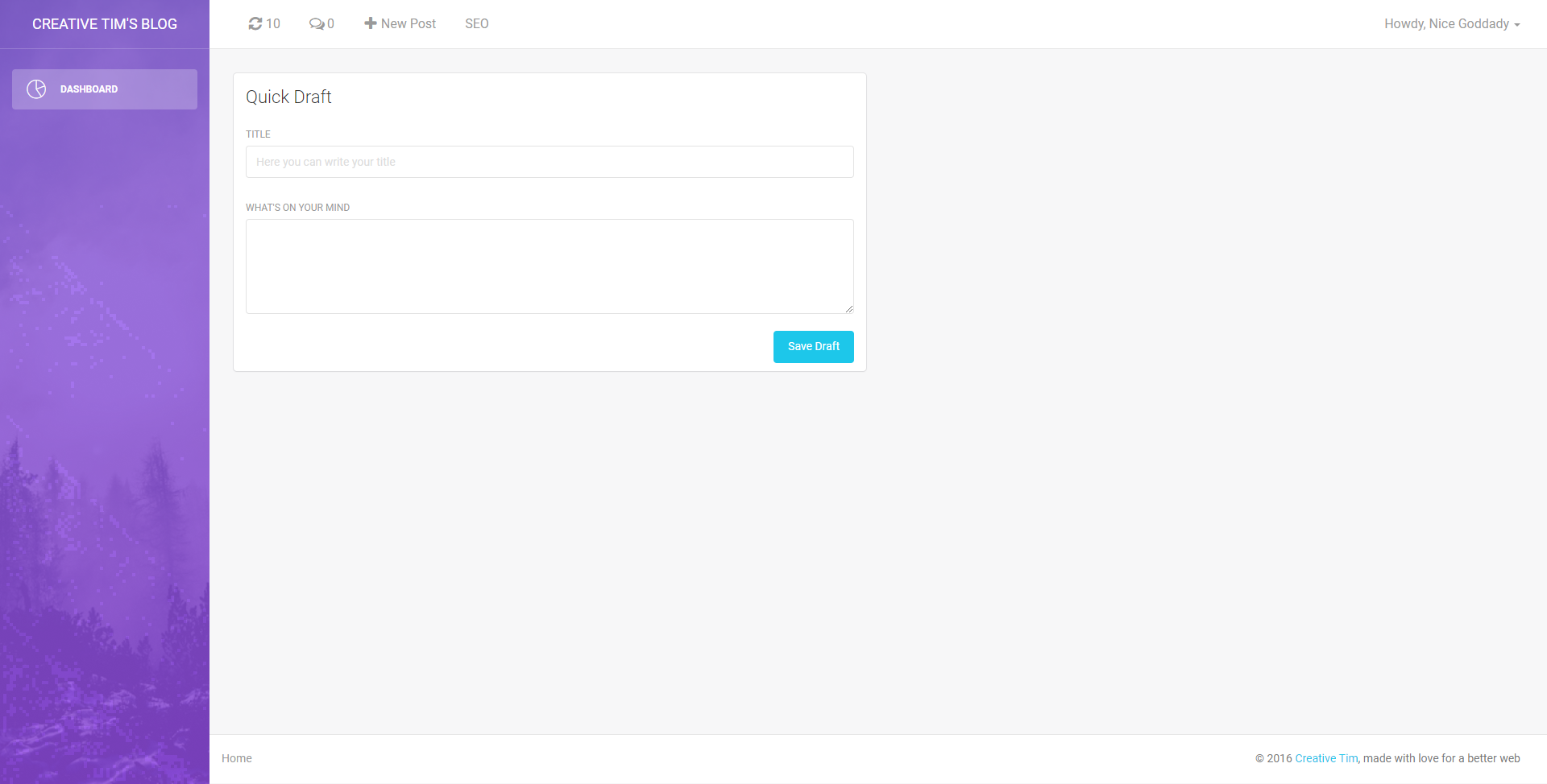
We have sections like Quick Draft, At a Glance or Activity.
The Quick Draft has a card which contains one input, one text area, and one Save Draft button.
We have this in our user profile, and we can use the left card.
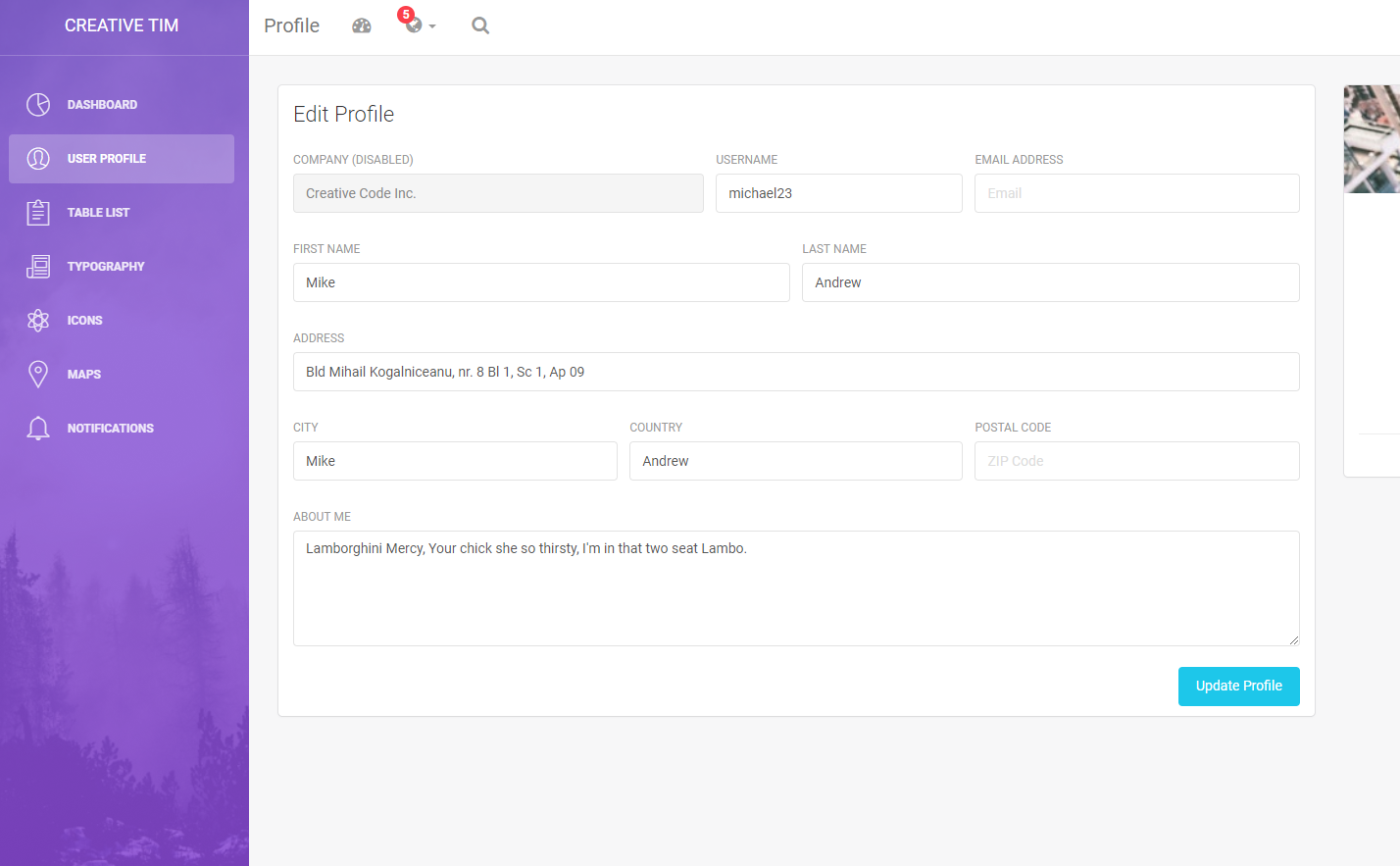
Step 9. Copy card from user.html into your template.html
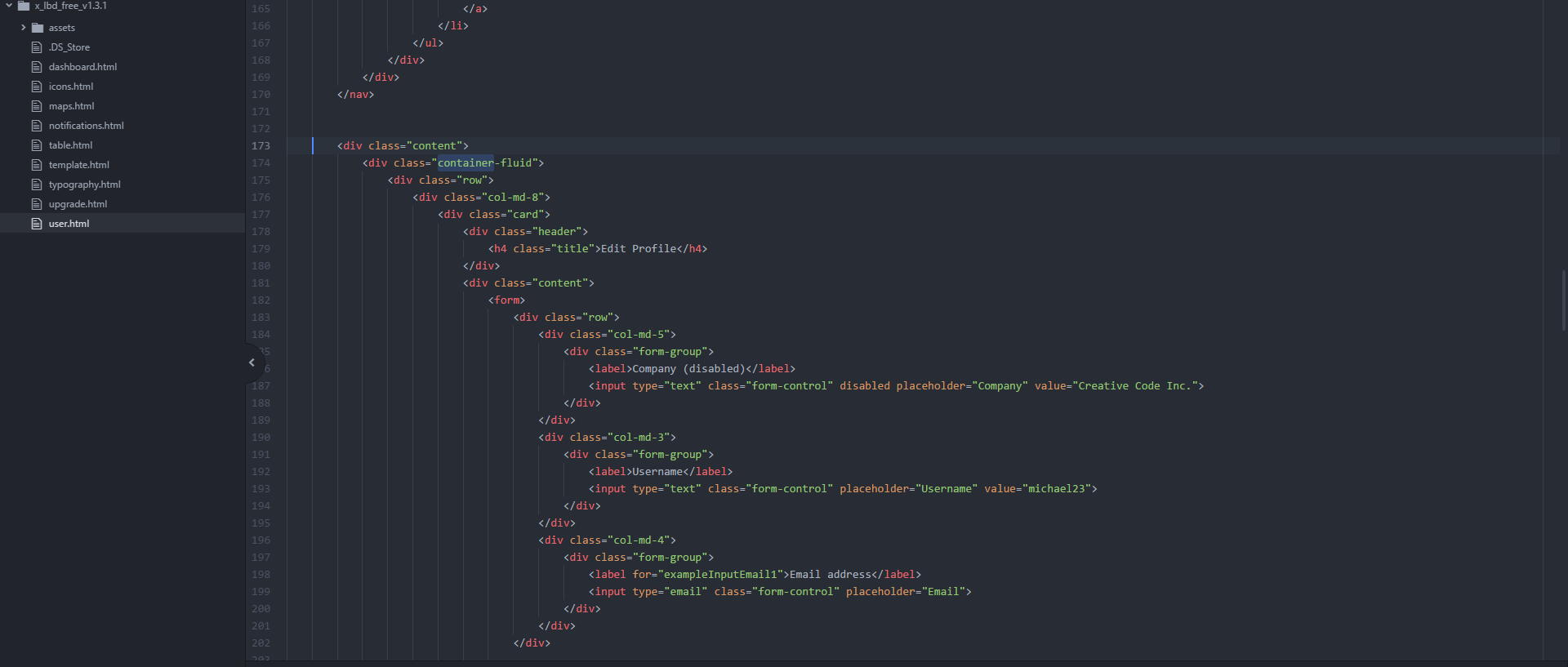
Your template should look like this:
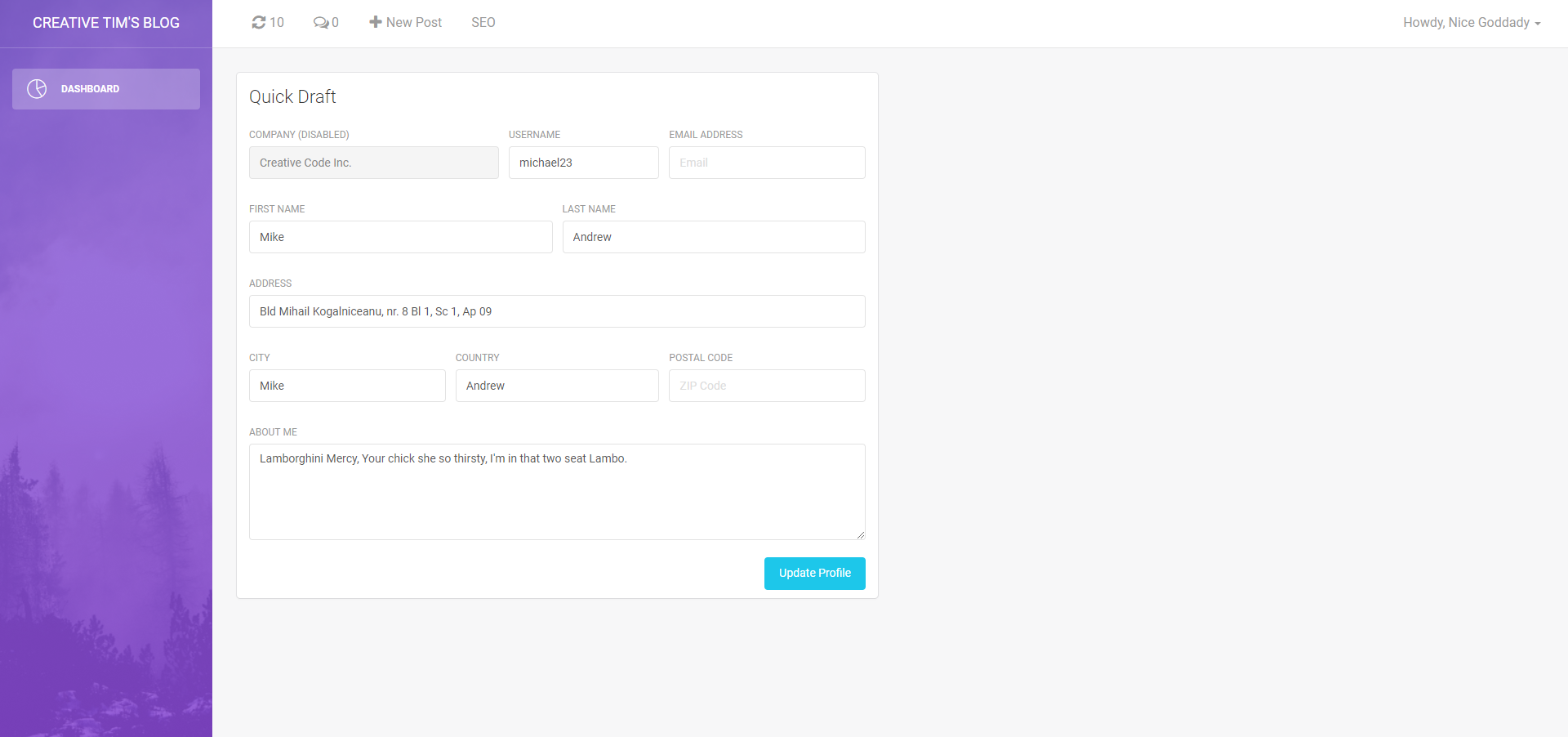
Beware that we used for this example a “col-md-6”
Step 10. Let’s delete some form overload 😈
For this card, we need a title, text area, and a button. The final code for this:
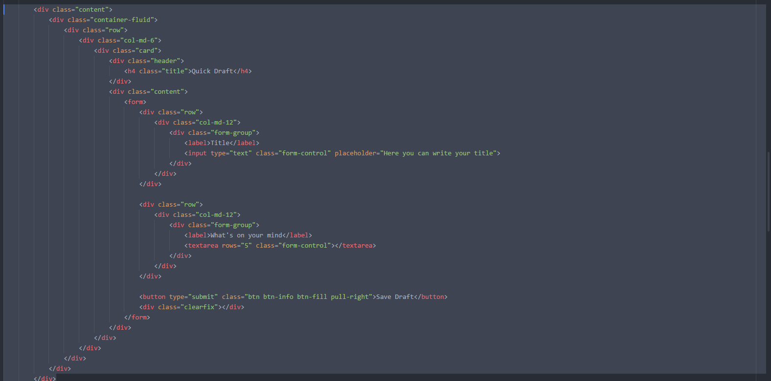
It should look like this:

Step 11. Recreate At a Glance Area
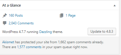
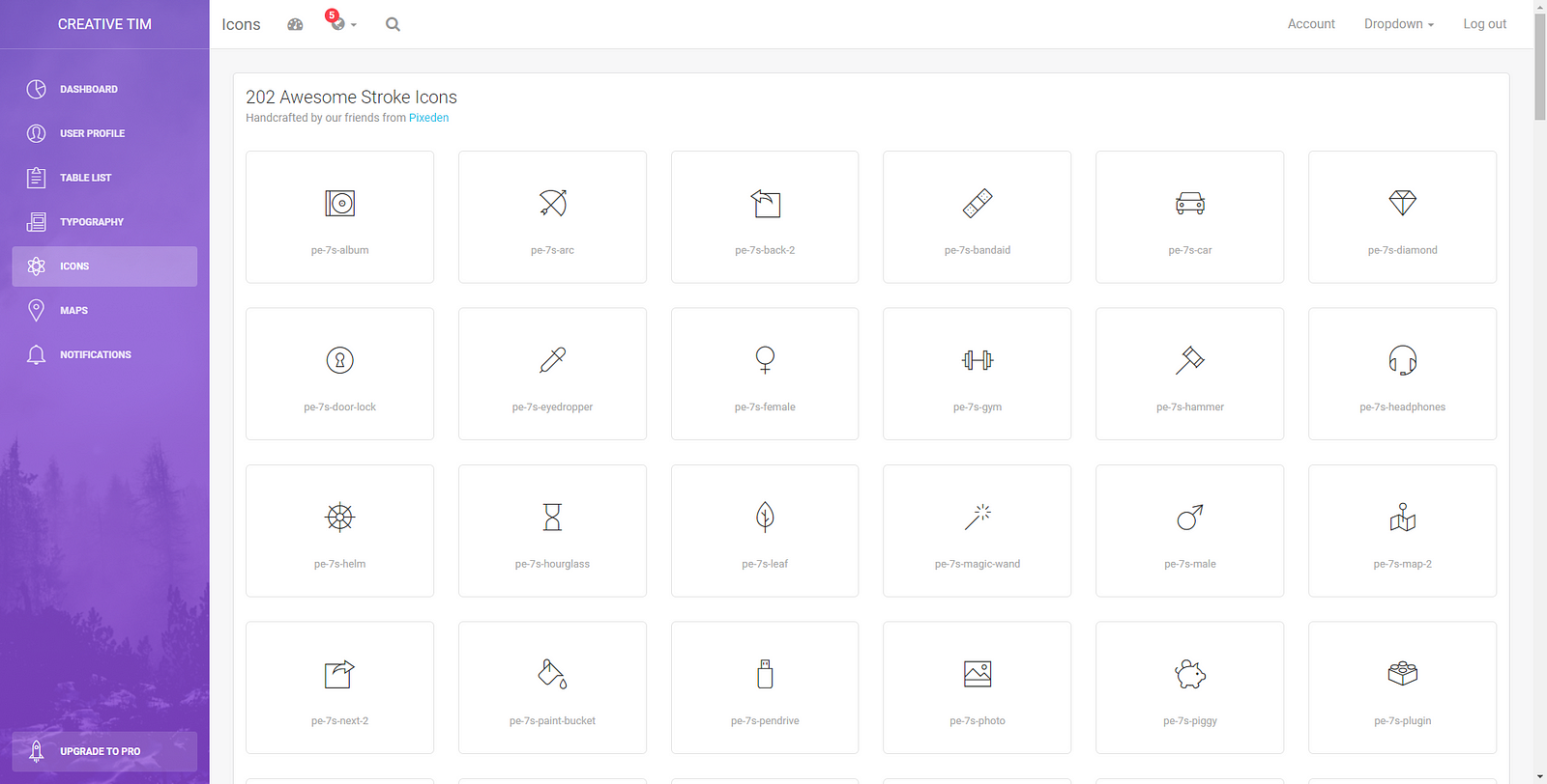
For this, we are going to use some stroke icons. I like them, and those are available in this dashboard. You can select icons from icons.html
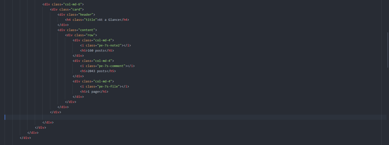
The code

Step 12. Let’s add some links to the text
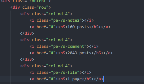

Step 13. CSS for bigger & better icons
First thing here is to create a new CSS file. Mine is called my-style.css
After you create this file, add it to your template.html

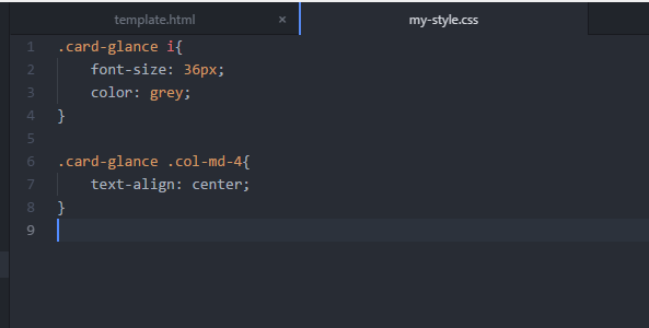
Add a new class in the glance card section

And now it looks better! 😀

Step 14. Add footer section for WordPress version


This is our first part of the tutorial. We’d be glad to know your feedback, and if you have any ideas on how to improve this, please tell us.
We want to make these tutorials better for you.


![15+ Top Black Friday & Cyber Monday Deals for Developers and Designers [2023]](/blog/content/images/size/w960/2021/11/black-friday-deals-developers-1.jpg)
