Web designers and developers understand more than most how difficult designing a user interface is. The client wants something that is easy to use, ties into their brand and follows modern design trends. They usually want the final product to be delivered quickly and within a tight budget.
The advent of front-end frameworks such as Bootstrap and Angular with their highly customizable CSS and JS elements have been a breath of fresh air but a full template may contain a lot of unnecessary code.

Developers are often forced into a tough choice: reinvent the wheel for each site or strip down a whole car before building on the chassis? UI kits provide a happy compromise.
What is a UI Kit?
UI kits are aimed at front-end developers who prefer to take a modular approach to build an app or a website but don’t want to be restricted by a template. Rather than source elements from various code libraries, developers can choose a UI kit based around their client’s design preferences; the characteristics of the app’s intended platform or a framework they like to use. They then build the website up from scratch.
For example, if a client wants their app to look like a Facebook app, there are UI kits featuring those design elements. If the app is to look good on an iPhone, a UI kit based on the iOS platform can speed up development. A Bootstrap 4 web UI kit will suit a front-end developer with experience and a preference for Bootstrap.
Some UI kits are less specifically designed around a theme but instead contain a huge number of different elements which can be combined in exciting and novel ways to create many different styles of website and app.
Together with the elements mentioned later in this article, a UI kit will also include a basic framework on which these elements can be hung. A popular example is Bootstrap of course with its grid system and mobile-first design. Pure.css, Base, and Material-UI are some others. There are many more.
The Advantages of Using UI Kits
One of the main advantages of using a UI kit is that it simply makes web development that much quicker. A faster development cycle means more sites can be built and hence efficiency increases.
With a UI kit, the design elements will also have a consistency that can be hard to match when taking elements from different libraries. This is why CSS frameworks were created in the first place.
However, unlike downloading and customizing a framework-based template, using a UI kit forces a front-end designer to think about exactly what is needed and what can be left out of a website. This means the final product will be lighter and more bespoke than a customized framework.
As an example, let’s look at button transitions. A template may contain four (or more) different states for a single button to be in at any time (e.g. normal, focused (hovered over), pressed (clicked) and inactive). If you are designing a button that will never be disabled, you will not need to add the inactive state into the coding. If you integrate UI kits with your UX research, you can more easily match your clients’ needs rather than disappoint them with templates which are not quite right.
From Elements to Demos
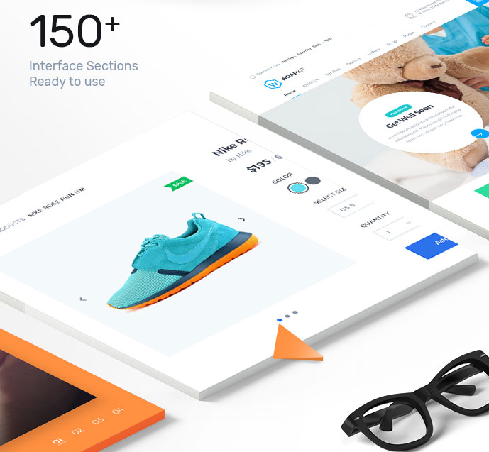
UI kits usually combine a combination of elements and more developed sections corresponding to screens, on an app, or web pages, on a website. Some will also include full demos for those projects requiring less customization.
You will usually find thousands of elements in a UI kit, including:
- Buttons and switches
- Input fields, radio buttons, and check-boxes
- Navbars, drop-downs, breadcrumbs, and menus
- Tooltips
- Tabs and cards
- Progress bars and sliders
- Icons and glyphs
- Headers and footers
- Social media share buttons
- Typographic options (fonts, headers, weights, etc.)
- Color swatches
- Widgets
- User interactions
- Modals and content areas
The actual elements included in the kit will depend upon the theme you choose. For example, if you choose a flat design UI kit, don’t expect to see gradients and shadows.
The UI kit is likely to also include several fleshed-out ‘sections,’ perhaps a landing page, a contact pages, a one-page scrolling parallax design, etc. These can be used to speed up a web build where only minor customization is required.
Some UI kits even include several complete ‘out of the box’ demos. You might decide that a project is so basic in scope that you can simply make do with using one of these with minor, if any, tweaking. Bear in mind that other developers may have had exactly the same idea and your website or app will not be unique in this case.
The beauty with UI kits is that you get to choose how you use them!
UI Kits Examples
Material Kit Pro by Creative Tim

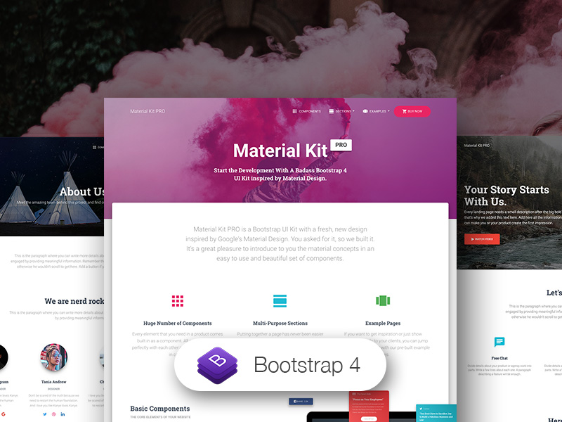
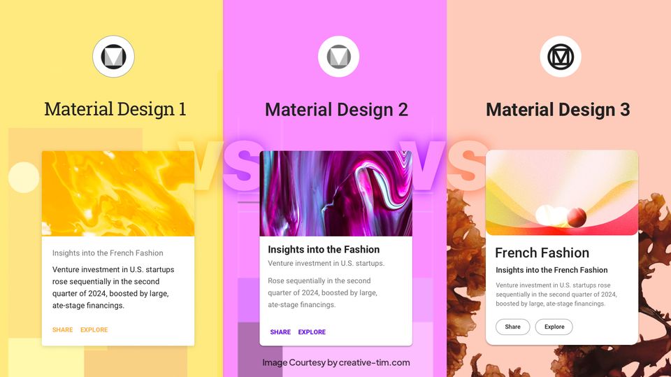
Material Kit Pro is a badass Bootstrap 4 UI Kit inspired by Material Design. If you like Google’s Material Design, you will love this UI kit. It is a premium UI tool that comes with a huge number of components built to fit together and look amazing. With Material Kit Pro you will save a lot of time going from prototyping to full-functional code because all elements are implemented.
Check out its features:
- It comes with 1000 Handcrafted Elements, 7 Customized Plugins, and 11 Example Pages. There are thousands of possible combinations!
- All components can take variations in color, that you can easily modify using SASS files
- Every item comes in 2 forms: PSD element and HTML/CSS/JS implementation
- Every component comes with separate layers organized in folders
- Every element has multiple states for colors, styles, hover, focus, that you can easily access and use
With Material Kit Pro, putting together a page has never been easier than matching together sections. From team presentation to pricing options, you can easily customize and built your pages.
Pricing: starting from $79 (Freelancer license)

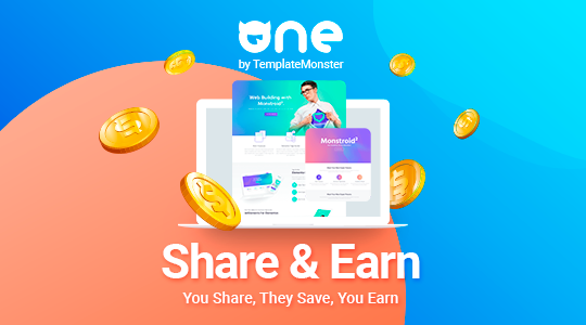
It has been around for a year. However, it has already managed to earn a big audience that has an interest in high-quality digital assets. Why does the membership draw the attention of many people? First of all, many of them want to download the necessary items without any limits. Moreover, it is easier to choose a perfect match when you have a chance to work with a set of products at once. You will not need to re-buy the most suitable ones after using them for your custom projects.
To cut a long story short, ONE by TemplateMonster will meet the needs of:
- web-developers and studios who require a big assortment of ready-made solutions for their original sites;
- business owners who need a set of assets to shape their online-projects and social media to increase the number of clients;
- designers and all people connected to graphics who edit their work in Adobe Illustrator or Photoshop;
- bloggers who need to decorate their site and social media profiles.
Without a doubt, it is crucial to look through a wide range of products included in the subscription. These are digital assets crafted for the most popular CMS and purposes:
- WordPress themes;
- CMS and eCommerce themes;
- plugins and add-ons;
- graphic assets;
- presentation templates;
- video and audio assets;
- free stock photos.
The assortment is growing, so you are going to have more variants to choose from.
Then, we cannot keep silent about prices. ONE by TemplateMonster offers three plans.
- The first plan is called Creative. It is a great choice for marketers, illustrators, and graphic designers. Its price is $82 per year. You will get a chance to download multiple graphic and design assets, presentation templates, video assets, and audio.
- The second plan is called All-in-One. Its price is $169 per year. It includes all the mentioned digital products and allows downloading them limitlessly for one year.
- The third plan is called All-in-One (Lifetime). Its price is $599. It is a one-time fee that guarantees lifetime access to the whole assortment.
ONE by TemplateMonster has more advantages that might assure you of choosing this subscription.
Which License is Right for you?
When deciding which UI kit to purchase, make sure you pay as much attention to the details set out in the license agreement as you do the design of the kit. You want to be sure that you can use the kit for your project whether that is a single, personal website or a multi-user commercial app. A premium UI kit may be more expensive than a free version but you will almost certainly have more flexibility in how you use the kit. Many UI kits offer a selection of different licenses for different users. More expensive licenses might also unlock extra support options or lifetime updates (very handy for developers wanting to keep on trend!)
In summary, UI kits are a collection of themed elements which can be hung on to an associated front-end development framework. Web developers can use them to build websites and applications from the ground up without having to mix and match elements from various code libraries. Providing the right license is purchased, a UI kit can be the perfect solution for a web developer looking for an effective way to speed up the workflow without sacrificing flexibility and creativity.
About Sunil:
Sunil Joshi is a co-founder of WrapPixel. His design skills cover investigating client requirements, identifying best user practices in emerging market environments, conceptualization and development of web page designs, user interfaces (UI) designs, and other custom built design solutions as per the business domain.
Stay connected with Twitter and Facebook


![15+ Top Black Friday & Cyber Monday Deals for Developers and Designers [2023]](/blog/content/images/size/w960/2021/11/black-friday-deals-developers-1.jpg)
