37+ Tailwind CSS Alerts Components
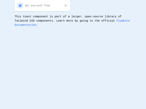
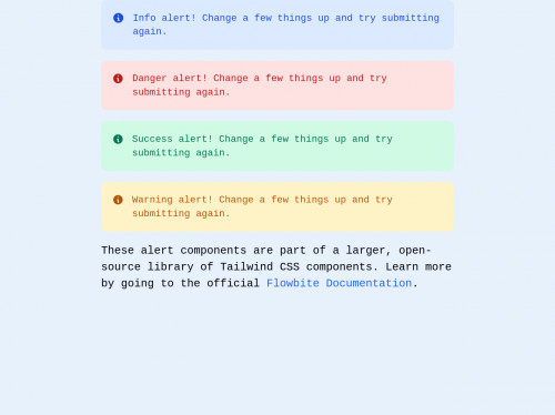
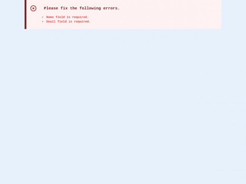
The Alert component is used to attract the user's attention without interrupting the user's task. See below our collection of Alert examples that you can add directly to your Tailwind UI project.
All Accordions Alerts Alpinejs Avatars Badges Banner Blockquote Bottom Navigation Breadcrumb Button Group Buttons Calendar Cards Carousel Charts Chat Checkbox Chip Collapse Cursor Dashboard Datepicker Device Mockups Drawer Dropdowns Faq Features File Upload Floating Label Footers Forms Gallery Grid Headers Headings Hr Icons Images Indicators Inputs Jumbotron Kbd Kit Layout Links List Logins Masonry Mega Menu Menu Modals Music Player Navbars Navigations Number Input Pages Pagination Paragraphs Popover Pricing Progress Radio Button Range Slider Rating Scrollbar Search bar Selects Shadows Sidebar Skeleton Slider Speed dial Spinner Stepper Switch Tables Tabs Testimonials Text Textarea Timeline Toast Toggle Tooltip Typography Video Widget


