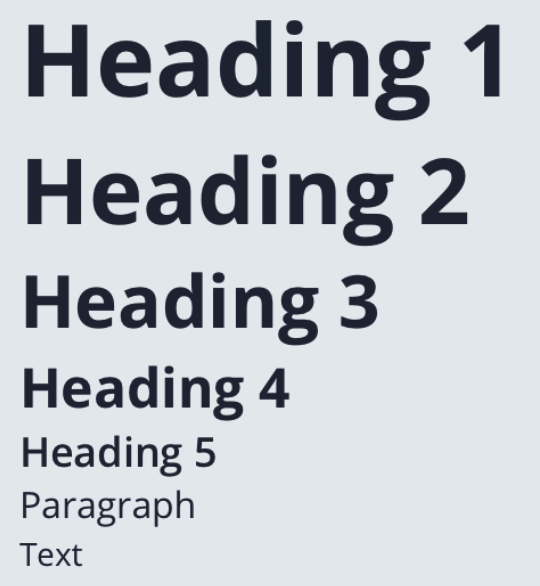
React-native Text
Our React-native text component is using a typeface which refers to the collection of related fonts (font family), and a font is a specific style existing within that typeface (bold, semibold, heavy, etc).
Typography is the art and technique of arranging type to make written language legible, readable and appealing when displayed.
The
Text
component is using a text base value of 14px which
can be customised from the theme constants. We included a
predefined text styles to easily reuse them in any app:
h1, h2, h3, h4, h5, p. Each style has a set of
values like
fontSize, lineHeight, fontWeight, fontFamily, that
can be configured independent from within the theme constants.
Example:

Default usage:
<Text>...</Text>Properties
| Property | Type | Default | Description |
|---|---|---|---|
| id | string | ‘Text’ | id for testID & accesibilityLabel |
| children | React.ReactNode | undefined | Renders a Text component to display text. Supports nesting, styling, and touch handling. |
| style | TextStyle | undefined | Renders the Text component with custom style, overwrite existing/predefined styles |
| center | boolean | false | Renders a Text with predefined textAlign: center |
| gradient | string[] | undefined | Renders LinearGradient component, colors |
| primary | boolean | false | Renders a Text color directly from the colors.primary value |
| secondary | boolean | false | Renders a Text color directly from the colors.secondary value |
| tertiary | boolean | false | Renders a Text color directly from the colors.tertiary value |
| black | boolean | false | Renders a Text color directly from the colors.black value |
| white | boolean | false | Renders a Text color directly from the colors.white value |
| gray | boolean | false | Renders a Text color directly from the colors.gray value |
| danger | boolean | false | Renders a Text color directly from the colors.danger value |
| warning | boolean | false | Renders a Text color directly from the colors.warning value |
| success | boolean | false | Renders a Text color directly from the colors.success value |
| info | boolean | false | Renders a Text color directly from the colors.info value |
| color | TextStyle[‘color’] | undefined | Renders a Text custom color value |
| opacity | TextStyle[‘opacity’] | undefined | Renders a Text with custom opacity value |
| size | ITheme[‘sizes’] | string, number, undefined | Renders a Text with custom fontSize |
| weight | TextStyle[‘fontWeight’] | undefined | Renders a Text with custom fontWeight |
| font | string | undefined | Renders a Text with custom fontFamily |
| bold | boolean | false | Renders a Text with predefined fontFamily from theme fonts.bold |
| semibold | boolean | false | Renders a Text with predefined fontFamily from theme fonts.semibold |
| start | LinearGradientPoint | undefined | Renders LinearGradient start points |
| end | LinearGradientPoint | undefined | Renders LinearGradient end points |
| h1 | boolean | false | Renders a Text with predefined fontSize from theme sizes.h1 |
| h2 | boolean | false | Renders a Text with predefined fontSize from theme sizes.h2 |
| h3 | boolean | false | Renders a Text with predefined fontSize from theme sizes.h3 |
| h4 | boolean | false | Renders a Text with predefined fontSize from theme sizes.h4 |
| h5 | boolean | false | Renders a Text with predefined fontSize from theme sizes.h5 |
| p | boolean | false | Renders a Text with predefined fontSize from theme sizes.p |
| align | TextStyle[‘textAlign’] | undefined | Renders a Text with custom textAlign |
| transform | TextStyle[‘textTransform’] | undefined | Renders a Text with custom textTransform: ‘none’, ‘uppercase’, ‘lowercase’, ‘capitalize’ |
| lineHeight | TextStyle[‘lineHeight’] | undefined | Renders a Text with custom lineHeight |
| right | TextStyle[‘right’] | undefined | Renders text right offset |
| left | TextStyle[‘left’] | undefined | Renders the View left offset |
| top | TextStyle[‘top’] | undefined | Renders the View top offset |
| bottom | TextStyle[‘bottom’] | undefined | Renders the View bottom offset |
| position | TextStyle[‘position’] | undefined | Renders text position |