Tailwind CSS Image Gallery
Showcase images effectively with the gallery component in David UI. Tailwind CSS styling supports grids, layouts, and responsiveness, making it ideal for portfolios or media-heavy pages.
Explore our component examples to integrate stunning image displays with ease.
Basic Gallery
This example provides a clean and responsive image gallery arranged in a grid. It adapts seamlessly from a single column on small screens to multiple columns on larger screens. The images maintain a uniform size using the object-cover class, ensuring consistent proportions and a polished appearance.






Masonry Grid Gallery
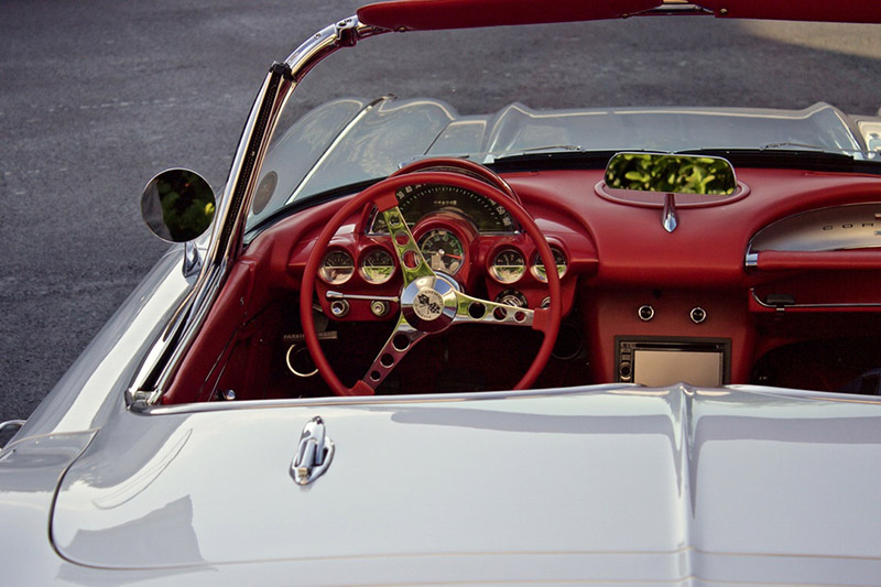
For a more dynamic gallery, this example uses nested grids to create a visually compelling layout. The structure enhances the visual hierarchy, making it ideal for showcasing collections in a more engaging and storytelling-friendly format.


Featured Image Gallery
Highlight a primary image with this gallery design, which pairs a prominent featured image with smaller thumbnail images below. This layout is perfect for product displays, portfolios, or galleries that emphasize a key visual element with selectable alternatives.


Quad Gallery
This gallery example features a horizontal scrolling format on smaller screens and a spacious layout on larger screens. Each image is styled to ensure clarity and adaptability.


Gallery With Tab
Organize images into categories with this tabbed gallery. Users can toggle between tabs like "App," "Messages," and "Settings" to view different sets of images. This design is perfect for applications requiring a structured and user-friendly approach to presenting grouped visuals.
Required Script
The Gallery component in david-ai requires JavaScript to handle image switching and thumbnail interactions. The library provides smooth transitions and interactive behavior through data attributes.
Installation
To use the Gallery component in your project, you first need to install the david-ai library via npm:
Basic Usage
Using with Global Access
If you prefer, you can use the DavidAI global object instead of directly importing initGallery:
Using with CDN
You can include david-ai via a CDN and initialize gallery functionality globally in the browser. Add the following script to your HTML file:
HTML Code Example
Gallery with tab
The gallery with tabs component requires the same JavaScript from the Tabs component to function properly. Please refer to the Tabs Component documentation for the required initialization code.
